Red (2010)
Red was the movie I was given for my current brief. I had seen it years ago when it was released however after watching it again recently I enjoyed it a lot more. The movie consists of four retired CIA agents who have been branded as 'RED' (Retired, Extremely, Dangerous) and need exterminating. The characters are played by all time classic actors/actresses who each have a distinguishable 'don't fuck with me attitude'. I like this factor as I believe it is also a metaphor for themselves in real life, each actor is getting old now and have featured in a lot of films but this film brings back their excellent acting skills which is kind of like "hey we've still got it" kind of attitude.


Watching the film helped me get ideas on what I wanted to design for a poster. Each character has an individual iconic outfit in the movie that represents them in different ways. Helen Mirren for example wore an elegant white flush jumpsuit which reflected her elegance and style, she wore this outfit when they were plotting an attack on the vice president of America blending her into the crowd in the scenes but still really giving off that badass attitude. Another scene was where Morgan Freeman was sacrificing himself to save the rest of the group, wearing an outfit to represent an impostor it still gives his character the respect that he has achieved many things in his lifetime and that this was his final act to do his duty. 


- Research -

Epilepsy Society


About Epilepsy Society:

About one in every hundred people in the UK has epilepsy and around 75 people are diagnosed with the condition each day. Our vision is a full life for everyone affected by epilepsy.  
Together we make a real and lasting contribution to people’s lives in every way that we can. We work to inform and connect people through the provision of our online forums, our helpline, and our various information leaflets and factsheets; we campaign and we raise awareness. We provide expert specialist residential, respite and social care and we have over 200 specially trained volunteers across the country who assist people in finding information and who can share their own experiences.
We undertake cutting edge medical research and are committed to better understanding epilepsy, improving diagnosis and treatment and making a seizure-free life a reality for all those with epilepsy. With expertise in brain imaging, genetics, pharmacology, epidemiology and psychology we are always at the forefront of medical research in the field.
Donate to Epilepsy Society and give hope to the future.

War on Want


About War on Want:
Poverty is political. The decisions of politicians in rich countries can mean life or death for people in developing countries. We have the power to reshape the global landscape - to ensure that people across the world can live in justice and peace.
War on Want works with some of the bravest and most inspiring groups in the world. In rural communities, in factories and sweatshops, in conflict zones and on the margins of society, we work with people fighting for real, lasting change.
The Salvation Army

About The Salvation Army:

The Salvation Army is a worldwide Christian church and registered charity
Working in 126 countries, demonstrating Christian principles through practical support; offering unconditional friendship, and very practical help to people of all ages, backgrounds and needs.
Founded in East London
By William Booth in 1865, The Salvation Army is one of the largest, most diverse providers of social services in the United Kingdom. A visionary social reformer ahead of his time, William Booth believed that charity demeaned the individual and people should be offered a ‘hand up' and not ‘hand outs' to get them back on their feet.
Today
The Salvation Army extends a helping hand to those who are homeless, friendless and in need. We passionately believe that no one is beyond hope, however great their problems. That disadvantaged people are given respect and access to the practical, social and spiritual support they need to realise their God-given potential and recover their personal dignity.
Local Salvation Army churches
Or corps as we call them - and community centres offer a range of activities and services within local communities. People can get involved in all sorts of ways, through volunteering with fundraising initiatives, attending church services and helping with local activities.
In the United Kingdom and Ireland, The Salvation Army has approximately:
  • 50,000 members
  • 4,000 employees
  • 1,500 Salvation Army officers (full-time ministers)

Conclusion

Looking at other charities apart from Skatepal I have found some very intriguing and heart tugging charities that I would simply love to raise money and awareness for. However Skatepal is appropriate because it links to what we do ourselves which is bringing people together to express creativity and design.


- Research -


I looked into the website for the charity our group was looking to corporate with. Their goal is to get young children together to lean skateboarding which is beneficial to their health and creativity. As most Palestinians struggle to find work and are unemployed this works to help them do something amongst the community and express themselves.  


We thought that this would be a good charity to do as it relates to us ourselves wanting to express our creativity. Looking at the videos featured on the website it shows the press coverage around the world and how the main audience is in the UK which shows it is already well known, The Guardian has also mentioned the charity in its newspaper which is beneficial to our research.


- Research -

Sarah Schoenfeld was an artist I came across on a blog who instantly inspired me for this brief. Her work is so intriguing and exciting its hard not to find it interesting. Whether you have tried mind altering substances or not we all have an idea of what drugs can do to a persons physical and mental state. What Sarah did was used over exposed photographical paper and dropped liquid forms of various drugs onto them which gave almost a visual representation of how the drugs effect the chemical balance in our bodies. As the shapes and colours are so vibrant and energetic you can almost tell what effects each different drug do to a person. This is what inspired me most with my development as I thought I could incorporate this idea of visual drugs onto a sleeve which represented the era and drug addiction of Marc Bolan the frontman of T. Rex.

- Adrenaline -


- Caffeine - 


 - Cocaine -


 - Crystal Meth -


 - Ecstasy -


 - Herion -


 - Ketamine -


 - Ketamine -


 - LSD -


 - Magic -


 - Ophiril -


 - Speed -


 - Speed + Magic -


 - Valium -


- Research - 


This image was taken in Urban Outfitters. It shows a good range of different genres of music which helped me define what exactly stands out and catches attention from the shelf. However in my opinion people who still buy vinyl's do not exactly go for the design but are looking for a band or genre in particular. Never the less the sleeves with the more vibrant colours and exciting patterns do catch instant attention which pulls in the audience to see what band it is. 


This Talking Heads sleeve I thought was quite intriguing and drew instant attention. The different blocks make up and image of the band which I thought was interesting, against the bright red background it still isn't too in your face as the clothes they are wearing are still plain and neutral. I am a fan of brightly coloured vinyls with another contrasting colour as I believe it is more visually pleasing and could entice the public into buying the vinyl.


This sleeve I thought was fantastic and unique. Although the face looks fairly creepy I think the different coloured beads make it exciting and vibrant. The different tones and gradients in the sleeve add a psychedelic feel to the sleeve which is something I want to feature in my own sleeve as that is the era the band was around in.


Good old Rolling Stones. This again caught my attention with the different contrasting colours all layered next to each other, I also like the collage of faces that have been put into the different hairstyles of the 60's/70's. It reflects the bands ability to dip into different genres of music and get away with it. You could also say it reflects the sexual advantage the band gained with the popularity in women in the 60's70's which are shown with all the different hairstyles.


This sleeve was one of my favourite designs. The black background contrasting with the vibrant dots adding energy and excitement onto the sleeve. Although it is unclear exactly what it is or what it represents it leaves the audience with a sense of curiosity. The only criticism is the use of the typeface in the top left corner, although it shows the name of the band which is vital, I think the design could of had a much bolder impact with just the dots on the page, maybe the name of the band on the back. 


This also caught my attention on the shelf as again is it unclear what exactly is going on in the image and has a nice psychedelic feel to the design. This however I think is successful as it gives a sense of mystery and curiosity within the design drawing instant attention with the vibrant colours and patterns.  


This I thought was a cool example of an illustration based design for a sleeve. It contains so much detail and depth that it almost is too much for your eyes to look at. I do however think it looks exciting and full of energy but would like to of seen some colour on the sleeve, even just pastel shades or gradients I think would lift that boldness from the design making it easier on the eye.


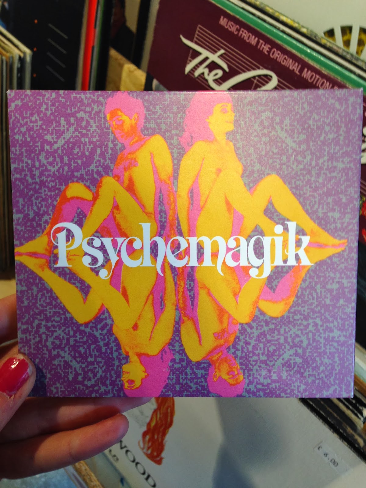
This I found in Urban Outfitters. I thought it as a fantastic example of modern days interpretation on the psychedelic era of the 60's/70's. The naked women could represent the sexual revolution whilst the colours also contribute as it reflects the rise in popularity of recreational drugs such as LSD. Its full of vibrancy and energy which are elements I want to somehow represent in my own work as I think it shows that era of music well.


Again this caught my attention with the use of vibrant colours and different overlaying images. Everything about the design is very in your face and makes a bold impact, whether or not this reflects the music that the band makes, the design gains enough interest for the public to be curious enough to purchase it.


I liked this design because although it contains also of detail for the eye it still has a minimal and clean look about it which I think is extremely effective. The little vector images give the sleeve more of an interesting feel but still does not distract you from the thin san serif typeface. The colours however could be a little more exciting but then again that could be the tipping point for the design and could be too much.


This I thought was very interesting. The black background focuses your attention on the vibrant design in the centre of the sleeve which I thought was successful and effective. I think it also has a psychedelic feel to the sleeve with the different colours, gradients and distorted image of the baby in the centre. It is definitely something I am considering using in my own work.


This sleeve I thought was a good example of a design that is heavily type based. The colours draw instant attention as they contrast with the black background making a visually exciting impact on the sleeve. The words also do not make a sentence which causes curiosity within the design.


I really love the use of gradients on this sleeve. It gives off a very tropical Caribbean feel which is also supported by the glowing typeface at the bottom. Gradients I think can be dangerous sometimes as they could look like a tacky example from Microsoft Word 2004, however this gradient has a faint texture which I think works really well on the sleeve as it could of came from an image itself.


I took a picture of the shelves in Urban Outfitters as I thought it would be good to get an idea of what designs stand out and makes an impact with the rest of the sleeves surrounding it. Out of the different sleeves I found the brightly colour Annie Mac CD and the Psychedelik CD stood out the greatest, mostly because of the use of vibrant and exciting colours.


- Research -


In Leeds city centre there is a fantastic record store called Jumbo that I visited which helped me get an idea of the band I was designing a sleeve for. It had a mixture of vinyl's and CD's each representing different types of music and genres. 


This sleeve I thought was an excellent example of the band T. Rex, I feel it represents the band well as it shows the frontman Marc Bolan in action with a golden distorted glow around the outside of him. It shows the power and energy the band had when performing their music. The black background also contributes to the effect as it contrasts with the golden glow allowing it to make more of an impact and standing out.


Another example of a T. Rex sleeve I found which I thought looked successful. The distorted black and white image makes it easy to recognise the frontman of the band who appears to be surrounded by sparks in the background. This could signify the whole 'glam rock' image that the band represented, whilst also adding energy and excitement to the image. The bold typeface also contributes to the energetic album cover as it contrasts with the black and white colour scheme making an impact on the sleeve. This is something I want to consider in my experiments as I think it has a good eye catching effect on the shelf.


This is an example of a CD cover for the band T. Rex. It again features the lead singer and guitarist Marc Bolan and another band member Steve Peregrin Took, this will enable the public and fans to easily recognise the band and purchase the CD. The use of the bright psychedelic typeface gives the cover vibrancy, it also oozes the whole era the band was together for. Another element I want to consider using in my experiments as it draws instant attention and makes it look more interesting.


Powered by Blogger.

Sample Text

Popular Posts

About

Download

Recent Posts