- Research -
This image was taken in Urban Outfitters. It shows a good range of different genres of music which helped me define what exactly stands out and catches attention from the shelf. However in my opinion people who still buy vinyl's do not exactly go for the design but are looking for a band or genre in particular. Never the less the sleeves with the more vibrant colours and exciting patterns do catch instant attention which pulls in the audience to see what band it is.
This Talking Heads sleeve I thought was quite intriguing and drew instant attention. The different blocks make up and image of the band which I thought was interesting, against the bright red background it still isn't too in your face as the clothes they are wearing are still plain and neutral. I am a fan of brightly coloured vinyls with another contrasting colour as I believe it is more visually pleasing and could entice the public into buying the vinyl.
This sleeve I thought was fantastic and unique. Although the face looks fairly creepy I think the different coloured beads make it exciting and vibrant. The different tones and gradients in the sleeve add a psychedelic feel to the sleeve which is something I want to feature in my own sleeve as that is the era the band was around in.
Good old Rolling Stones. This again caught my attention with the different contrasting colours all layered next to each other, I also like the collage of faces that have been put into the different hairstyles of the 60's/70's. It reflects the bands ability to dip into different genres of music and get away with it. You could also say it reflects the sexual advantage the band gained with the popularity in women in the 60's70's which are shown with all the different hairstyles.
This sleeve was one of my favourite designs. The black background contrasting with the vibrant dots adding energy and excitement onto the sleeve. Although it is unclear exactly what it is or what it represents it leaves the audience with a sense of curiosity. The only criticism is the use of the typeface in the top left corner, although it shows the name of the band which is vital, I think the design could of had a much bolder impact with just the dots on the page, maybe the name of the band on the back.
This also caught my attention on the shelf as again is it unclear what exactly is going on in the image and has a nice psychedelic feel to the design. This however I think is successful as it gives a sense of mystery and curiosity within the design drawing instant attention with the vibrant colours and patterns.
This I thought was a cool example of an illustration based design for a sleeve. It contains so much detail and depth that it almost is too much for your eyes to look at. I do however think it looks exciting and full of energy but would like to of seen some colour on the sleeve, even just pastel shades or gradients I think would lift that boldness from the design making it easier on the eye.
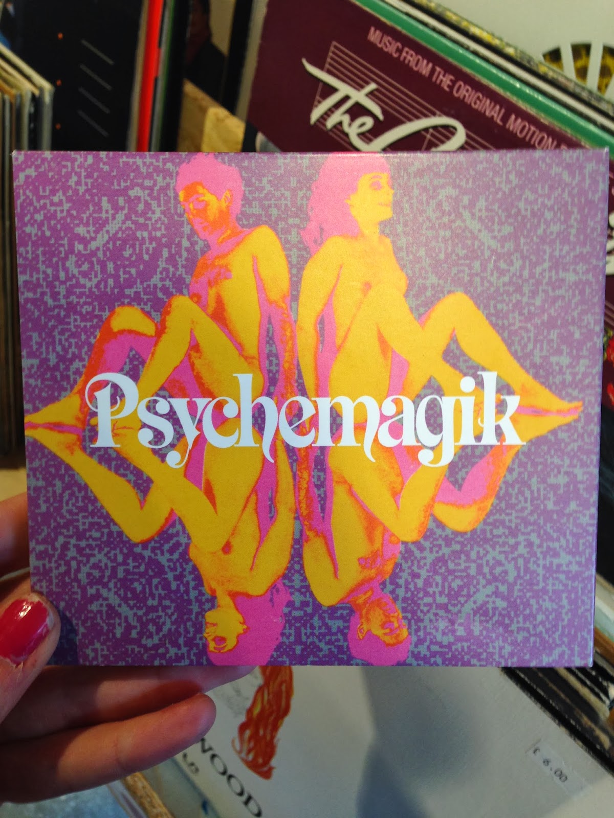
This I found in Urban Outfitters. I thought it as a fantastic example of modern days interpretation on the psychedelic era of the 60's/70's. The naked women could represent the sexual revolution whilst the colours also contribute as it reflects the rise in popularity of recreational drugs such as LSD. Its full of vibrancy and energy which are elements I want to somehow represent in my own work as I think it shows that era of music well.
Again this caught my attention with the use of vibrant colours and different overlaying images. Everything about the design is very in your face and makes a bold impact, whether or not this reflects the music that the band makes, the design gains enough interest for the public to be curious enough to purchase it.
I liked this design because although it contains also of detail for the eye it still has a minimal and clean look about it which I think is extremely effective. The little vector images give the sleeve more of an interesting feel but still does not distract you from the thin san serif typeface. The colours however could be a little more exciting but then again that could be the tipping point for the design and could be too much.
This I thought was very interesting. The black background focuses your attention on the vibrant design in the centre of the sleeve which I thought was successful and effective. I think it also has a psychedelic feel to the sleeve with the different colours, gradients and distorted image of the baby in the centre. It is definitely something I am considering using in my own work.
This sleeve I thought was a good example of a design that is heavily type based. The colours draw instant attention as they contrast with the black background making a visually exciting impact on the sleeve. The words also do not make a sentence which causes curiosity within the design.
I really love the use of gradients on this sleeve. It gives off a very tropical Caribbean feel which is also supported by the glowing typeface at the bottom. Gradients I think can be dangerous sometimes as they could look like a tacky example from Microsoft Word 2004, however this gradient has a faint texture which I think works really well on the sleeve as it could of came from an image itself.
I took a picture of the shelves in Urban Outfitters as I thought it would be good to get an idea of what designs stand out and makes an impact with the rest of the sleeves surrounding it. Out of the different sleeves I found the brightly colour Annie Mac CD and the Psychedelik CD stood out the greatest, mostly because of the use of vibrant and exciting colours.