
The grid system in graphic design is a way of organizing content on a page, using any combination of margins, guides, rows and columns. It is commonly seen in newspaper and magazine layout with columns of text and images. One grid, or a collection of grids, may be used across an entire project to achieve a consistent look and feel. In a finished product, the grid is invisible, but following it helps in creating successful print and web layouts.
Once the grid is established, it is up to the designer when and how to break out of it. This doesn’t mean the grid system in graphic design will be completely ignored. Instead, elements may cross over from column to column, extend to the end of the page, or extend onto adjacent pages. Breaking out of the grid can lead to the most interesting page designs.

I am very fond of this grid layout as I think it captures attention instantly whilst not being too over the top. There is little information on the page keeping it clean and minimal, this will keep the audience interested as it is not too much for them to read. The colour scheme I think also works very good too as the vibrant red adds excitement and interest on the page whilst the black and white keep it from looking cheap and messy.
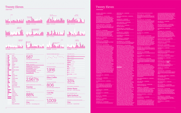
This is another grid layout I am fond of as again it seems very minimal and clean. Although there is a lot more body text on this double page spread than any other I have researched, the right hand side for instance I think is too much. The small and packed body text is extremely hard to read which would not make me interested in what it has to communicate. The left however is an improvement as it also contains graphs and different scaled type which breaks up the body text. By also using vectors and different scaled type I am considering using this technique in my own double page spreads to get my desired effect.

This example of a grid layout I think is fantastic. It draws instant focus on the page, the use of the orange contrasting with the brown and grey adds vibrancy and interest to the page which is definitely something I want to try in future developments. The mixture of the illustrations and type make it have much more depth and excitement within the page, I breaks that grid boundary but still has that professional graphic design element which I am fond of.


